The Professional Webspace of Designer and Illustrator Kevin Cornell:
"Design, Art, and Lackluster Humor."
How an A List Apart Illustration Comes Together
I've had a lot of inquiries about my process over the past couple of months. It's always been rather difficult to answer these questions, because I approach each job with a different process, dependent on the needs of the resulting art. But lately, I have noticed a loose pattern all my jobs tend to follow — and while not every job can be shoe-horned into a rigid assembly line of tactics, they all seem to pass through the following phases. One job in particular consistently follows this "general process". So in this article, I thought I'd rustle up a few paragraphs describing how I go about producing an A List Apart Illustration.
The Message
Generally speaking, the process for any illustration begins with determining just what the image is supposed to communicate. In the case of A List Apart, every illustration is created to support whatever point the article is trying to make. So the first thing I do when I get an ALA article is... read it.
Revolutionary, eh? Well, it's a step worth mentioning because I'm reading with a definite agenda — to find the core message (or as they called it in elementary school, the "theme") of the article. Once I've figured out that article's main point, I can move on to the next phase.
The Concept

I believe the concept is the most important part of any illustration; or any artistic endeavor, for that matter. Artistic styles go in and out of fashion quick as a rabbit on rockets; the best way to ensure an illustration remains relevant long after its style grows stale is to make sure it's based on a relevant idea. Notice I don't say ground-breaking. Or even clever. After enough people have mimicked it, even the most clever ideas become cliched. But at the very least, an illustration can still be effective if it's getting a message across.
In the case of the ALA illustrations, I try to think up visual situations that support, echo, or accentuate the article's core message. If the article is about "making informed choices", then maybe an illustration that echoes the concept of testing could work. If it's about "redesigning for a reason", maybe I'll draw the results of an unnecessary redesign. Whatever the case, the illustration must be a slave to the concept, and the concept a slave to the article.
But enough about theory. How does the process start?
My first step is to jot down as many illustration ideas as possible. Every concept is sketched out just coherently enough so I can understand what's going on in it; sometimes I even can get away with describing the situation with a few hastily-scribbled words. In any case, the goal is to generate an unfiltered visual "list" of concepts. It doesn't matter if they're good or bad, or even embarrassingly idiotic. They just need to be pushed out of my thinkhole, and onto a piece of paper, or the back of a folder, or a desktop. Hell, even a Ham sandwich if that's all that's around. Anywhere is better than in my head, because they'll vanish in the cubbyhole.
The next step is to take the loose visual list and sort out the best ideas. I often put at least a day in between when I jot down concepts, and when I come back to them for the rough phase. Why? Because I need to forget what each of them was trying to say. Coming back to them later, I can approach them objectively, and really separate the ones that are successfully communicating the same message as the article, and the ones that probably should be buried in the backyard with a live hand-grenade.
The Rough

So now I've weeded out the concepts I want to pursue, and entered the vital stage that bridges the gap between an illustration's soul (its concept), and its body (the final art).
The Rough Phase requires versatility. I produce my roughs with a pencil because it's quick, easy to make changes with, and able to get across all the important virtues of the final art — tone, contrast, form, and composition. Even when the final art is in color, I prefer to work with pencil roughs and give an example of coloration based on prior finished art, rather than doing color roughs.
The reason for keeping this stage so fluid is because this is where I try to contain all the revisions to the art. The process of revising a pencil drawing is much quicker than revising a watercolor, a relatively unforgiving medium compared to acrylic or oil (and definitely compared to digital coloration, blessed with multiple undo's).
In a perfect world, you'd get every illustration right on the first try. But in most cases, it's going to take a couple of rounds to arrive at a place where both you and the client are happy with the direction. It's important that you expect revisions, and prepare for them. Yet, in any job, time is of the essence; so it's just as important that you protect yourself from entering round after round after round of revision. The best solution I've found for this is charging a revision rate per round. If people aren't concerned by the precious time the revision loop might be eating up, they'll at least be concerned by the expanding budget; a hopeful consequence of which is that it forces the revisions to be weighed carefully, and provided in one round.
With A List Apart, I am blessed to have had very few instances where the roughs required a revision round more than once (and you can be sure it was for all the right reasons). If there is a minor revision, they'll more often than not just ask that I incorporate it into the final art. Generally, I think it's best to have a rough that everyone has approved before moving onto the next stage; but this is always a judgment call. If the revision seems too extreme, I'll do another rough just to be safe.
Final Art

The best part about the Final Art Phase, is the peace-of-mind. If I've arrived at this stage, that means that my biggest concern with any illustration — that the concept is healthy — has been attended to. So now I've got an idea that I like, that the powers-that-be like, and I've already figured out and gotten approval on about three-fourths of the components of an image. For me, this relieves a lot of the pressure of rejection; and it allows me to enjoy the act of creating the final art. Not to say that technically executing the image won't have its own associated stresses (ahem... color), but much can be forgiven of an illustration when it rides into town on a sleek, well-groomed concept.
In Closing
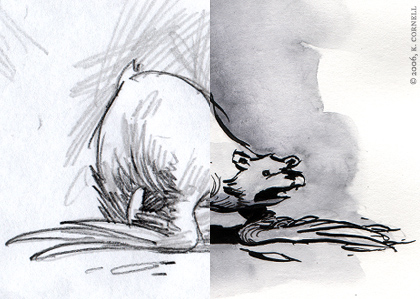
So that's the A List Apart process, which could very well just be referred to as my Illustration Process. Undoubtedly, other Illustrators out there work in a similar fashion; and I'm sure there's a whole sackful that have an even better process in place. Which is rightly so; in a proper climate, everyone can tailor their process to suit their own needs. I hope this has given you some insights into your own work processes, even if it's just affirming that other people work in a similar way as yourself. As always when I write one of these long-winded, non-Mojo related posts, you're more than welcome to add your own thoughts in the comments. Now, just for fun, I'll leave you with a couple samples of finished ALA illustrations alongside their rough:
A Sampling of ALA Roughs/Illustrations


Comments on this Article
There are currently 28 comments.
2. John Nick
Great article! You mention fear of rejection -- could you illuminate that?
Is it a fear of having to start over from scratch? Is it tapping a self-esteem thing? Or is it because you have an emotional investment in the particular design and you want it to succeed for its own sake?
Tchaikovsky thought of his symphonies as his children. So, then ... Mojo ...
3. Heiko
Incredible illustrations and a very nice and interesting overview about a "step by step" process.
4. bearskinrug
Thanks Anders & Heiko!
John Nick - Well... I mean rejection in the sense that getting as many things approved along the way means I won't get to the end of the job, have a beautiful watercolor, and have the client say... "It looks good. But I don't like cows" or something like that.
Although I'd have to say that the fear of having concepts rejected is greater than the fear of someone rejecting the art's execution. Usually because going back to the drawing board after you've come up with a concept you love is like abandoning a baby. Redoing the art is more like having to put a new diaper on the baby.
5. mearso
Thanks for the interesting article. Always intruiging to see how illustrators work. Especially ones whose work you admire.
Just one question - and it might be silly - But what scale do you normally sketch and then illustrate at?
I often like the different quality a line takes on when blown up. I see your roughs on A4 are quite small. Do you then continue in that size?
cheers
6. bearskinrug
Mearso - I usually do the roughs and illustrations in two formats... there's the half-column, and a full-column. The half column work is drawn probably at about 3"x4", and full-column stuff is probably 6"x3". It's never TOO exact.
I then scan everything in at 300 dpi, and let Stan deal with sizing the work down to where he wants it.
7. BigA
FINALLY!!! At long last a peek inside the process. I particularly enjoyed the roughs along with the finished deal. More of this please.
8. Jason
Great bit of writing here... always nice to see someone elses process.
I must say though, I'm a bit jealous of your watercoloring skills... I've tried to get that look down for a long time, and it usually ends up looking like someone just spilled a glass of H2O on my work... Guess I didn't pay enough attention in my painting classes.
9. zombiefactory
Nothing like some breakfast and a good read.
BTW, I got my books finally and read through them all last night. Not sure which is my favorite, but they all had me chuckling. Looking forward to the fourth.
10. Somejeff
My mother said that to me once:
"Things to say? It doesn't matter if they're good or bad, or even embarrassingly idiotic. Shut your cubbyhole!"
Out of curiosity, was mom's fridge full of your childhood drawings, or were your parents as supportive as mine?
12. Ian
I really like the side-by-sides at the bottom. As a refresher, you should note the over-arching concept of each below.
13. jason
your pencil work kicks, hatching's tight. also, do you ink wash over further pencil roughs and add ink after? And what's intriguing is the fact that you get a day to mull it over! Turnaround time these parts IS a day...
14. Kim
Hugh G - as Kevin's wife, I can surely say that wearing pants is not an essential part of his process.
16. Julian Schrader
Thanks for the insight to your work - I like it very much, it impresses me everytime I read an ALA-article!
17. bearskinrug
Biga - Well, I definitely had you in mind when I wrote this thing :D
Jason - Haha - well, with watercolor, so much of the texture is up to the watercolor. I really don't have much control over it...
Zombiefactory - Excellent! I'm looking forward to the fourth book too...
Some Jeff - My parents were always SUPER supportive; in fact, there's still a drawing I did in high school on the side of their fridge. Although... that's probably just hanging up there because they forget about it.
Hugh G. - I DO prefer to wear pants while I work with pencils or pens. I don't want to drop it and accidentally puncture my scrotum. But with a brush...
Ian - Ah! Excellent idea... I shall do it!
Jason - I always do a light pencil, then go over it with ink, then erase the pencil. Not that I mind seeing a little pencil through the wash... that's just how I've been doing it.
Julian - Thanks! I'm glad you liked it!
18. Ara Pehlivanian
I've been waiting for this article for... a long time. Glad you churned it out amigo ;)
19. Gustaf
Nice! I'm constantly facinated by "behind the scenes" pieces. Thanks for taking the time to share!
20. Billy
Always interesting to see the creative process broken down (without the all-too-familiar mistake of falling into the realms of self-indulgence).
You have a fantastic touch. As an illustrator myself, I'm always interested in a 'new angle' when approaching a new project. Being right-handed, I've recently experimented drawing with my left hand to achieve that 'child-like' simplicity that we all used to have. The results have been interesting.
Anyway, thanks again for giving this tin man a glimpse behind the wizard's curtain...
21. Travis Schmeisser
Sweeeet! I love hearing about artists' processes, thanks for writing this up. It's great seeing the contrast of your tight pencil sketches against the final watercolor version.
22. Julian Schrader
I just read http://www.alistapart.com/articles/flywheelsandfriction - how much time did it take you to create this illustration?
I have no clue - I'm not very good at illustrating/painting and I'm sure, I could spend weeks without any result.
23. funnelbc
Absolutely lovely. I really like the look that you achieve with black and white water colour.
Thanks for sharing the process!
24. bearskinrug
Ara - Haha - Yeah, I remember emailing you about process a couple months ago :D
Gustaf - Thank you!
Billy - Drawing with my left hand is SUPER frustrating... I've always thought "I should learn how to draw left-handed, in case I ever lose my right in a pencil explosion..."
Travis - Thanks!
Julian - Hmmm - well, I had the article for about three weeks. And what's funny is that I tried all kinds of different concepts, but in the end the best concept was right there all along as a subhead... Abandoned Shopping Carts. The actual illustration itself was about a day's work. It's hard to measure since I go in and out of other illustration work...
Funnel - Thank you for reading about it!
25. Drew
Keep in mind that what I'm about to ask you is completely and utterly off topic. I hope you don't hate me for it!
I've noticed on your shop page, when you click a different thumbnail for a given product there's a fade from white. Much to my interest, it seems as if its not a simple opacity fade type thing. To me, it looks like the image is fading from a higher contrast version of itself.
Am I going crazy or are you doing something special there?
26. bearskinrug
Nothing that Flash can't already do... I'll send you an email... :D
27. lydia
Ha...the axe in the pencil pot is random ( to me anyway), but really cool..........
28. bearskinrug
Haha - well, I was playing into the idea that in zombie movies people might use a hatchet to kill zombies. I suppose a shotgun is more appropriate... but they don't fit in the pencil pot as well ;)

[ Back to Top ]
Search Bearskinrug:


Other Sections You Might Want To Visit:
- The Downloads Section: Wallpapers for the Discerning Desktop.
- The Links Archive: A Collection of Interesting Tidbits.
1. anders
an interesting journey into the mind of Kevin Cornell...love the cows rough!